
SMC Academic Major Listing & Info Redesign Case Study
Enhancing the user experience by providing a smoother and more satisfying journey while navigating the Santa Monica College website to find information about degrees or certificates.
TEAM
Devin Williams
TIME
8 Weeks
ROLE
UX Research
UI Design
CLIENTS
Santa Monica College
(Potential)
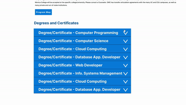
Current “Degree & Certificates” Page

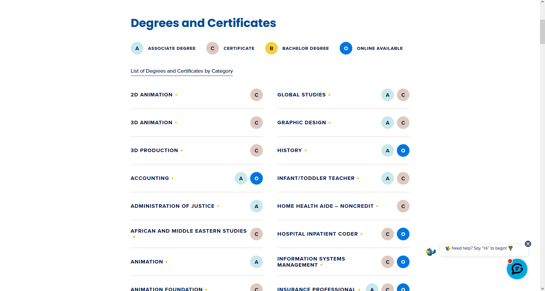
Current “Information” Page for Degrees & Certificates
Problems
Users of the SMC website have difficulties finding information on degrees and certificates.
Key Insights
In conducting user research, it was found that users had complications finding information on their majors since there were a great deal of options and tabs when searching for their desired major.
Goal
Based on our research for this project, our solution involves redesigning the "Degree and Certificates" page to make it more user-friendly and efficient, reducing overwhelm for users.
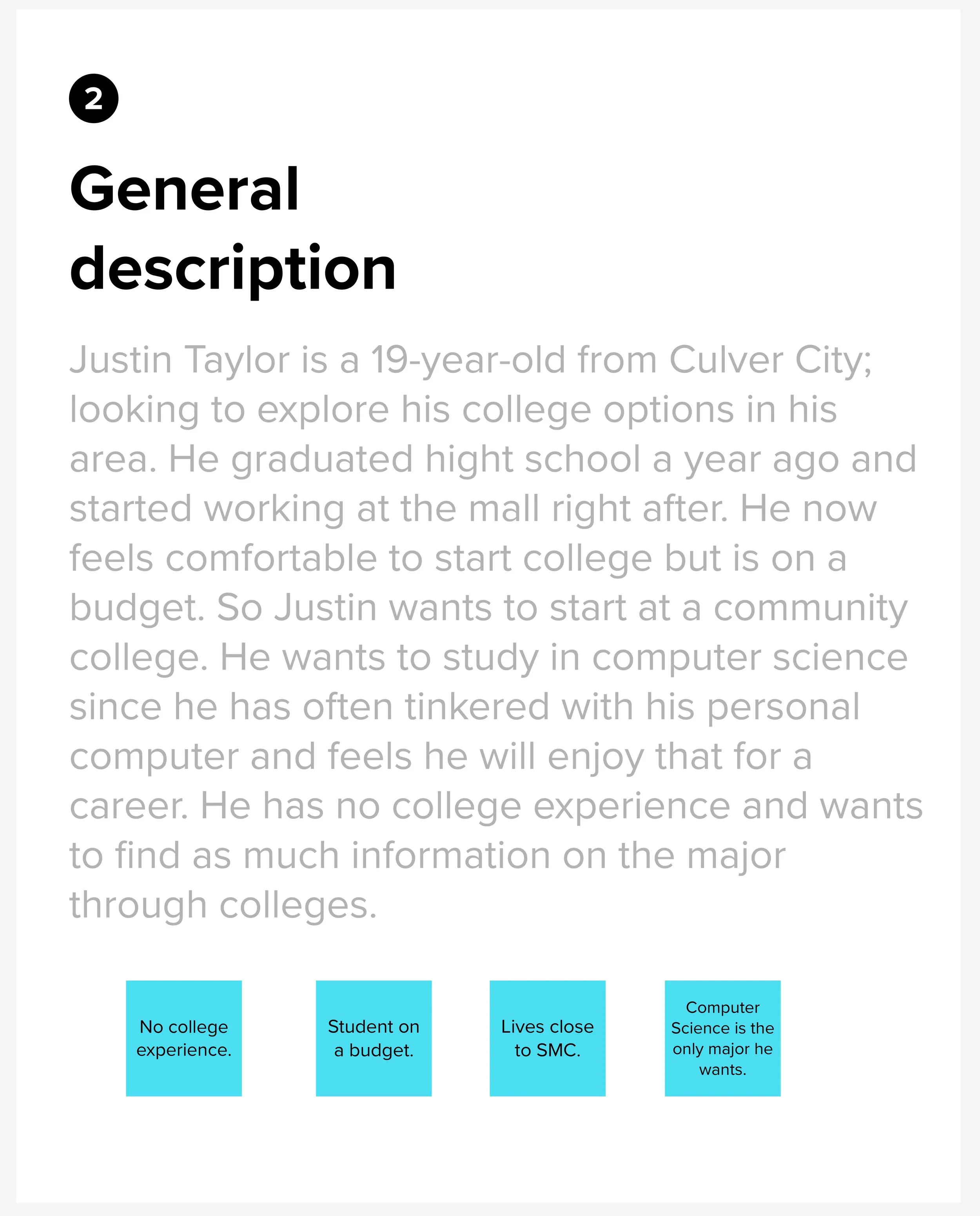
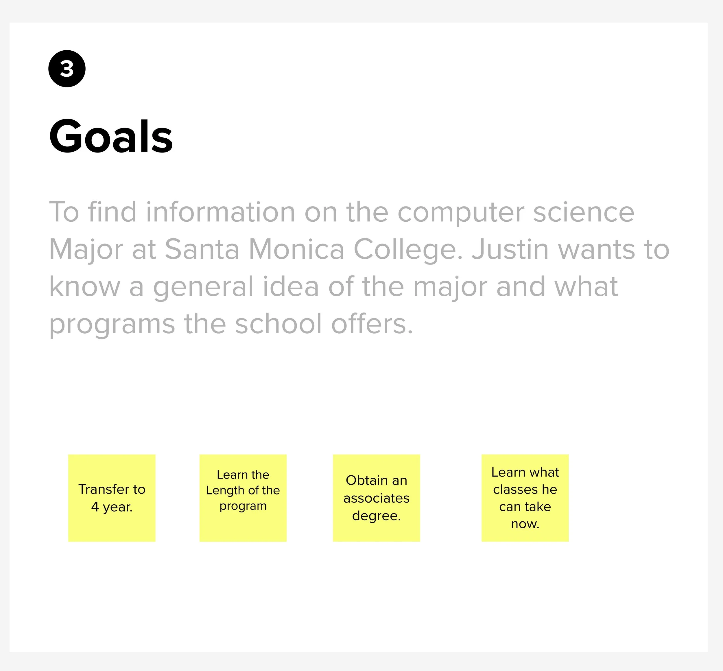
Persona


StoryBoard
The storyboard illustrates Justin Taylor's quick, targeted approach to locating the computer science page and pertinent major details. Impatient by nature, Justin swiftly clicks on the initial link for the major and navigates through the computer science page, clicking on links aligned with his objectives.
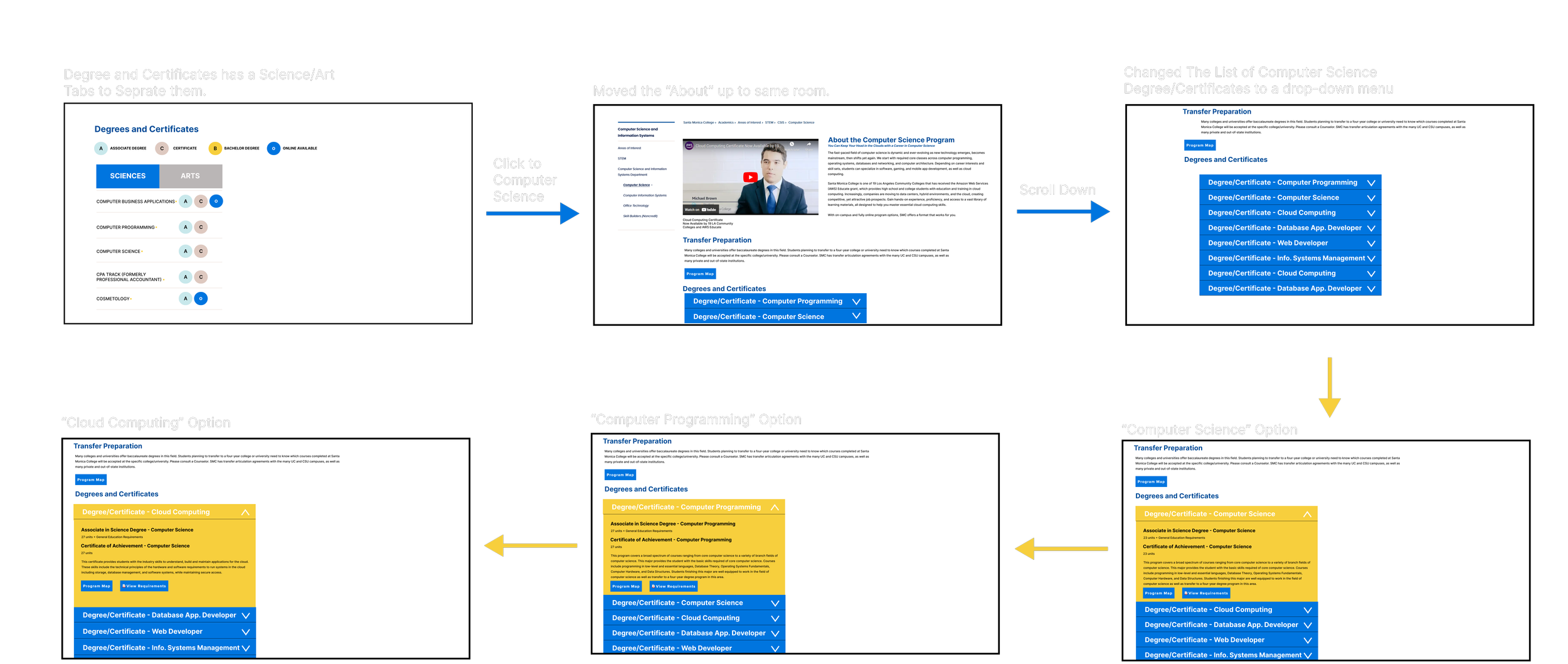
Wireflow
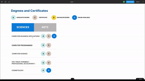
The Wireflow comprises four sections, detailing Justin Taylor's exploration of computer science. The degree and certificates page is divided between sciences and arts, streamlining the list of majors. Clicking on the computer science major directs Justin to its dedicated page, where the About section sits beside a video, optimizing page space. A drop-down menu then presents various computer science-related majors with descriptions and program links, minimizing Justin's need for extensive scrolling.


Wireframe


Prototype
Usability Test Results
During the Usability test, I interviewed Brent and Michael to gauge how the prototype addressed the case study challenge. Both found the "Degrees & Certificates" menu appealing. Brent critiqued the prototype's space allocation and the tab for various majors, while Michael highlighted the lack of contrast, a departure from standard website design practices.
Reflection
What I learned: The SMC website could use more effective ways of getting information to students. The website is designed well and needs to capitalize more on the spacing created.
What could Have been better: My solution of a drop-down menu in the ‘degrees and Certificates” tab could be more fluid and utilize the space created because of the size of the menu.